Branding – Music Distribution
CASE STUDY
Developing a logo and brand to launch Australian music distribution service, GYROstream, required a look-and-feel that would communicate this amazing service to their soon-to-be army of loyalists.
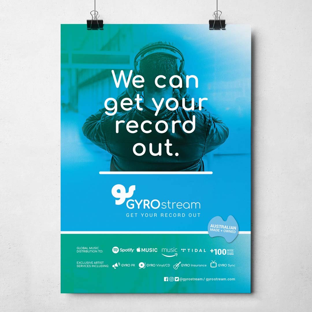
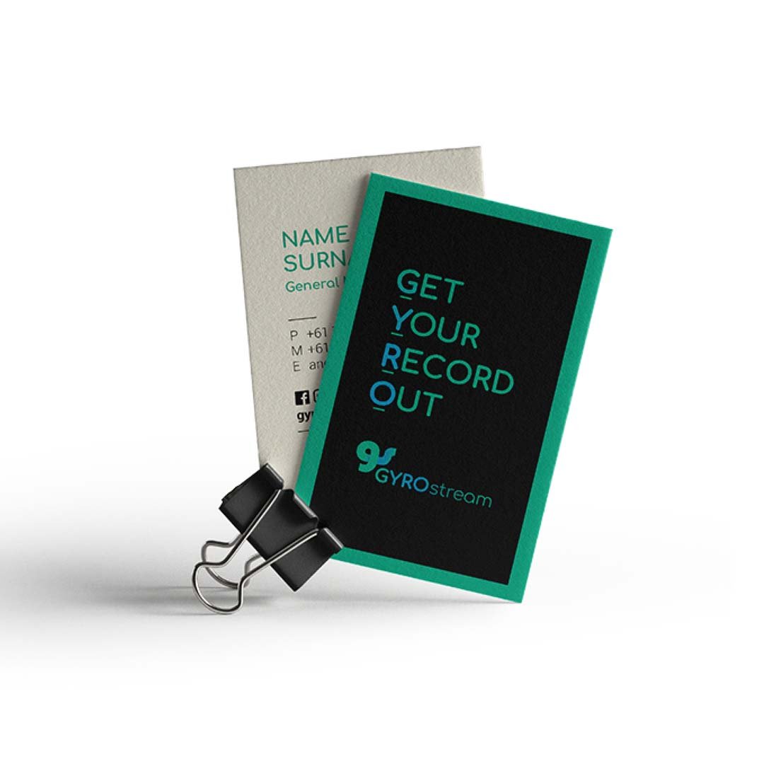
The brief was to create a professional-looking brand that would appeal to independent artists and communicate the streaming nature of the business. Creating something fluid and seamless to mimic the flow of music from Artist; to GYROstream; to Distribution; was integral for the brands visual communication.
Through development, this was achieved by linking the ‘G’ and ’S’ working as a stand along logo mark and a complete master logo. A blended colour pallet, inspired by gig lights, was added to the library of visual communication elements. These elements all work together to visually represent the business offerings in a fun yet professional tone.
“Working with Bec was easy. Her understanding of branding, what we needed and what our target market liked, matched up perfectly. Can’t wait to work with her again.”